In online crowdsourcing sites, ‘superusers’ are users who use the site at an exponentially higher rate than the average user. Digital Collections is not a crowdsourcing site, it provides no incentive for users to come back over and over again, so finding superusers is interesting.
These superusers can be found on the “frequency and recency” function on Google Analytics (Audience>Behaviour>Frequency and Recency), but Google doesn’t provide the number of visitors, only the number of sessions by those visitors. This sessions metric is problematic because the higher the number of visits, the more sessions they account for, but Google tends to avoid giving data on individuals out like the plague, as they promise not to in their terms of service. But with a total of 3,230 sessions by visitors with over 201 sessions under their belt, we can tell that there is up to 16 computers out there that account for over 201 separate sessions on the site, which is massive. To put this in perspective, DRIS staff have only gotten to about 150 at the highest, and they are working on the site every day.
By applying the Irish and non-Irish segments to the frequency and recency view, we get some interesting information. You would 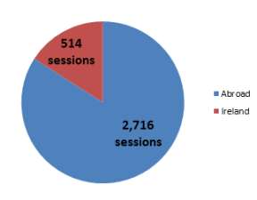 expect that visitors who return 150, 200, or more times would be more likely to be researching something in the archives, but actually the opposite is true: the ratio of Irish visitors tends to increase the bigger the return count is, but after 201 return visits, this trend reverses and the visitors from abroad dominate the numbers even more.
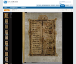
Finding out who these superusers are is key to growing from a user-base to a community, so to get around Google Analytics protecting identities of these users, we turn to StatCounter. If you have the free version of StatCounter, you can download the logs for the site for the previous 24 hours, which are really handy. They come in csv format, so you do some pretty advanced stuff with them in R when you get a big data set, but as we’re just looking for the few visitors with over 201 visits, we can just open them up in Excel and sort by descending number of sessions. As I could only look back  over 24 hours at any point, I only found one superuser, whose location is surprising: a tiny historical walled town of Castell’arquato. Because of the type of town this is and because they are looking at the Book of Kells every time the page view data is available, Tim and Gerald in DRIS got the impression that this is a municipal institution or museum that has a computer dedicated for viewing artefacts. The fact that they never visit on Sunday or Monday and the large screen resolution backs this up. This is why it’s really good to mix your analytics packages – Google Analytics is pretty unbeatable for functionality but StatCounter can give you gems like this in the logs.
Custom Dashboards and Automatic Reporting
One of the great things about Google Analytics is that you can set custom dashboards and automatic reports to make accessing your key metrics easier. So as a deliverable for this internship I put together a dashboard that shows important metrics of all of the key segments, visitors from academic institutions, and Dublin versus total Irish visitors. The key thing to remember in putting together a report is that they just contain data points, it’s the people reading them who draw conclusions from them. So you need to put together a set of metrics that not only reflect the institution’s goals, but also allow the person reading them to cross reference the data points to avoid drawing conclusions that are quick but incomplete. The best way to do this generally is to create a balance between acquisition, behaviour, and outcomes. This ‘end-to-end’ view helps prevent you jumping to conclusions based on noticeable findings from single data point. The dashboard shows where these visitors are coming from (referrals, direct, and social), and the average time spent on the site. Specific to the data discussed in the previous blog, which analysed how DRIS could catalyse more research, a great way to put this in place would be to compare the general, Irish, and Dublin use over time to
Standardised Reporting Across libraries
A big factor in what I saw in the data is that online digital resources, particularly in Irish universities, are possibly more dependent on each other than is apparent at first. As I mentioned in the second blog, University users of digital resources are probably very siloed, and the glimpse here of individual users suggests that heritage institutions and facilities can use these resources over and over again across institutions and really get value out of the digitised archive. But the only way to actually measure the prevalence of siloed research behaviour is by comparing data across institutions, where online archives would swap data on usage figures so they can see how they can meet shortcomings in each other’s collections. This is done already on a small scale – like if an archive has a specific collection (such as the Samuels ephemera or, of course, the Book of Kells), other institutions will guide people to it. But once we can see what people are looking ffor and what content they are finding (or not finding), it will be easier to provide a more seamless cross between the collections to put a wider range of materials for researchers to search for.
This isn’t that far of a leap to make. Archivists care about their collections, and anything that helps people who are interested in the artefacts in to see these collections stands a good chance of being considered. If you look at the Facebook profiles of online archives, they tend to like each other, so at least some connection is already happening organically, so the will to connect to each other’s archives is there.
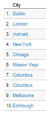 Look at the top 10 cities that had the most visitors on a couple of recent weeks: these are all cities known for having large Irish populations. So we can make a pretty obvious assumption that the Irish diaspora are driving the segments in the UK, US and Australia. The big usage spikes around St. Patrick’s Day back this up.